How Educated Are World Leaders?
Created By ALI ALMOSSAWI
This application provides an insight into the political longevity of world leaders and the level of their education.
This application provides an insight into the political longevity of world leaders and the level of their education.
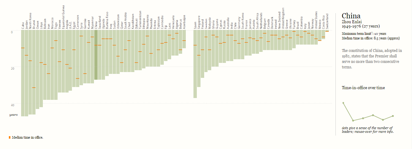
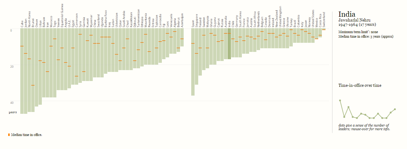
In the first visualization, the length of each of the bars gives the tenure of the leader who ruled the longest without interruptions in a particular country and the orange line indicates the median tenure.
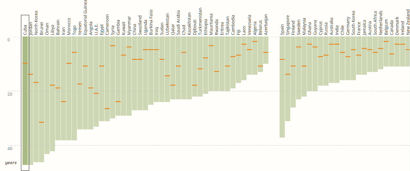
This representation of the median provides an insight into the extent of the usual ruling periods when compared to the longest reigns. Even though the set of countries in the visualization are divided into two groups
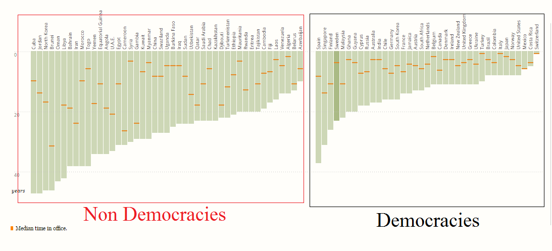
– democracies on the right and non-democracies on the left, it would have better if there was a header indicating the same. The countries are sorted according to the tenure of the rulers from highest to lowest.
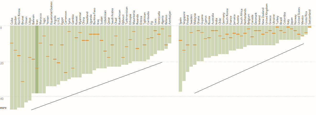
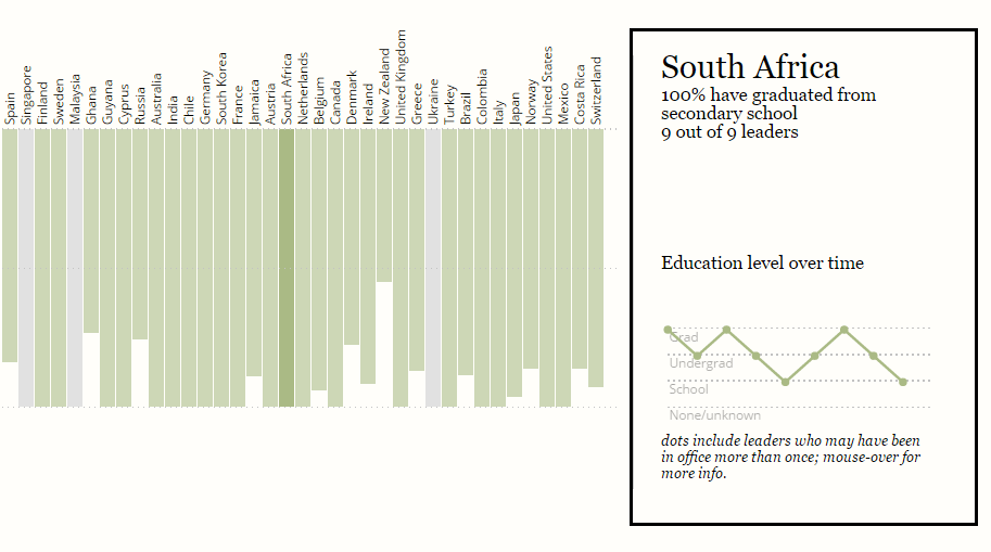
On hovering over a particular bar, detailed information showing the name of the country, leader with maximum political longevity and his/her exact tenure in years is displayed. Additional details like median tenure, maximum term limit and important changes in the political system if any, are also shown.
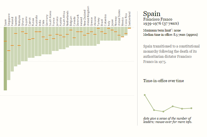
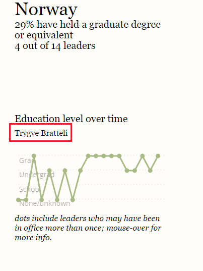
The line graph in the end shows the actual time in office on the vertical axis and the names of all leaders in chronological order on the horizontal axis.
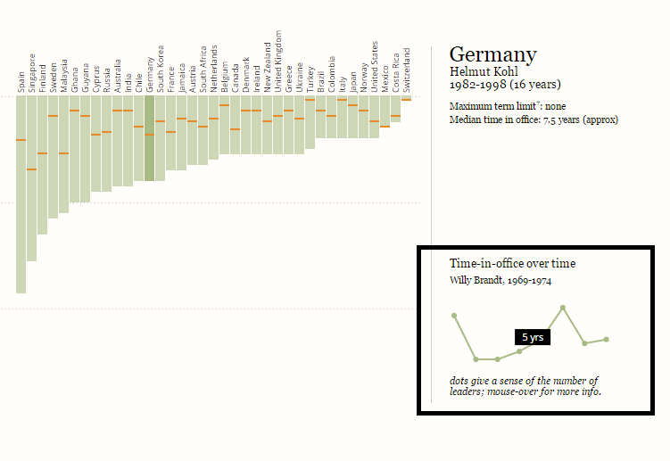
Each one of the dots indicates a particular leader and the dots by themselves give a sense of the number of leaders. However, the graph by itself doesn’t display the actual term and name of a particular leader unless the cursor is hovered on the dots. The other three visualizations contain the same two groups of countries sorted in the same order as the first one. This sorting order maintains consistency and makes comparison between the visualizations easier.
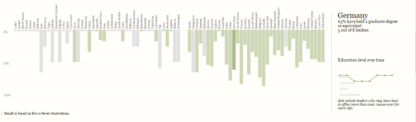
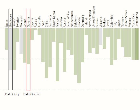
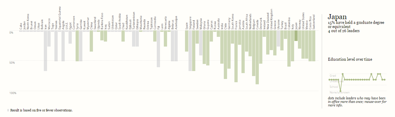
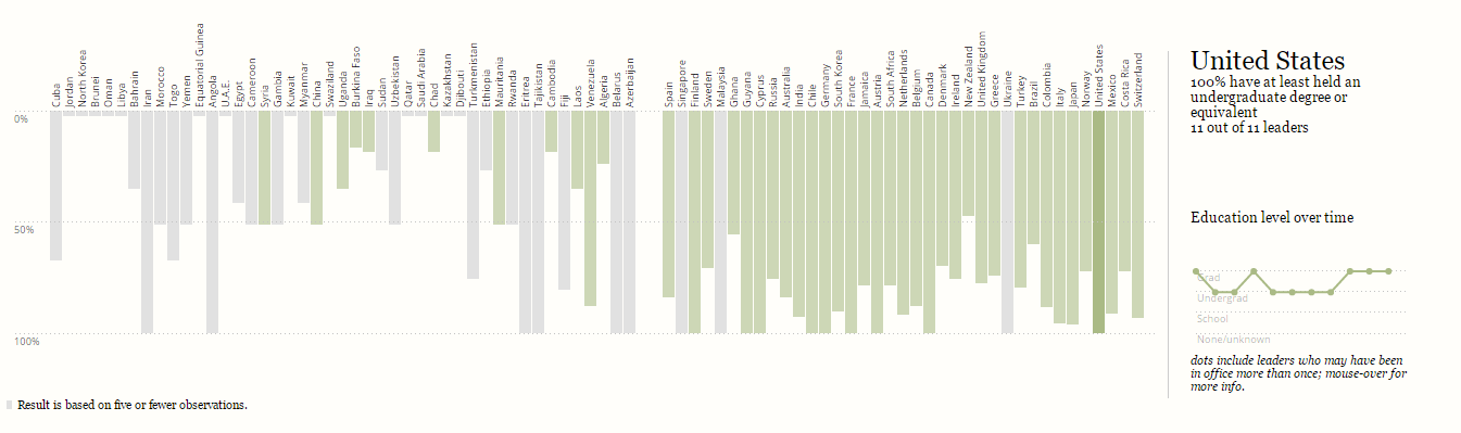
The length of each of the bars gives the percentage of leaders in a particular country with an advanced degree (for example, a masters or a doctorate or equivalent degree).
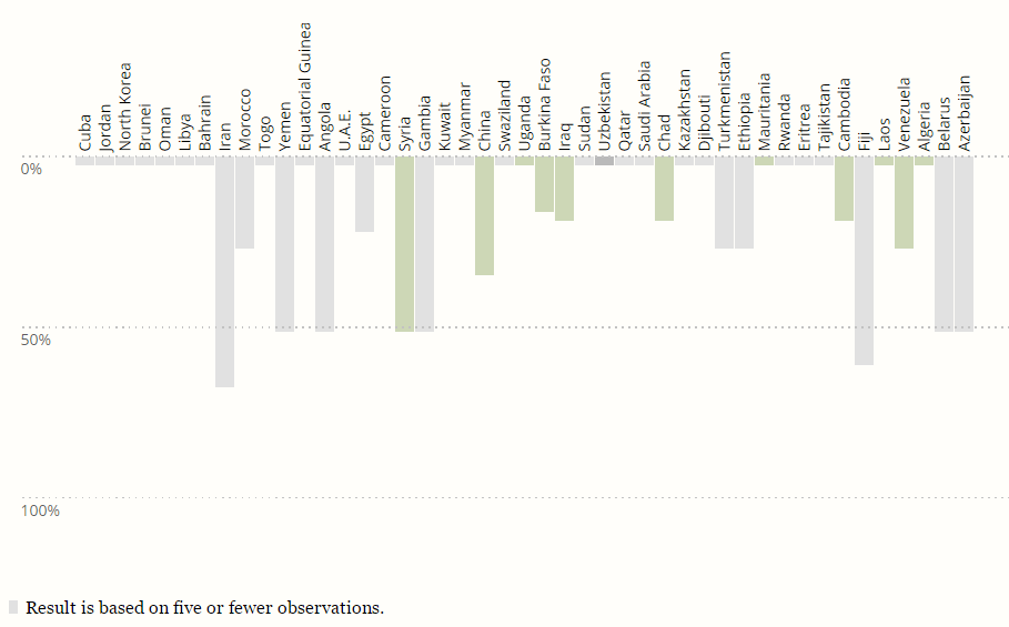
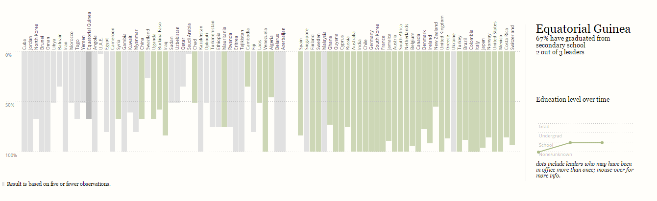
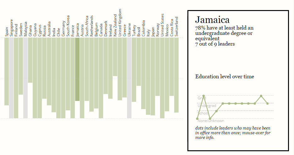
The rectangular bars of countries with five or fewer observations are shown in pale gray color.
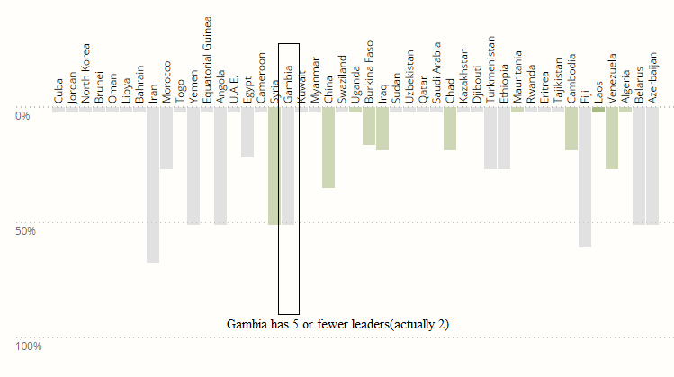
This color coding is also followed in the next two visualizations. On hovering over a particular bar, detailed information about the percentage of leaders with a graduate degree or equivalent is shown along with the actual number of leaders with graduate degree out of the total number of leaders of that particular country.
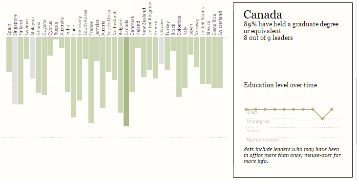
Moreover, when the total number of leaders are considered, the leaders that have repeated term were taken into account only once. The line graph from here on including the third and fourth visualizations shows the level of degree earned by each of the leaders in a chronological order.
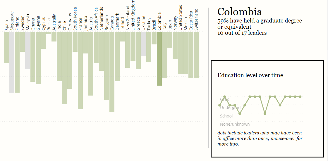
On hovering over a particular dot corresponding to leader, his/her name is displayed.
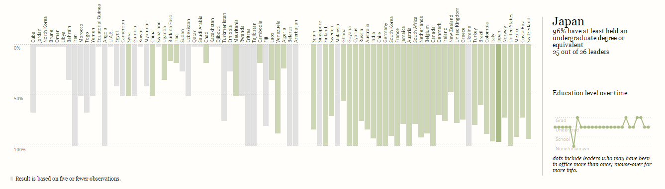
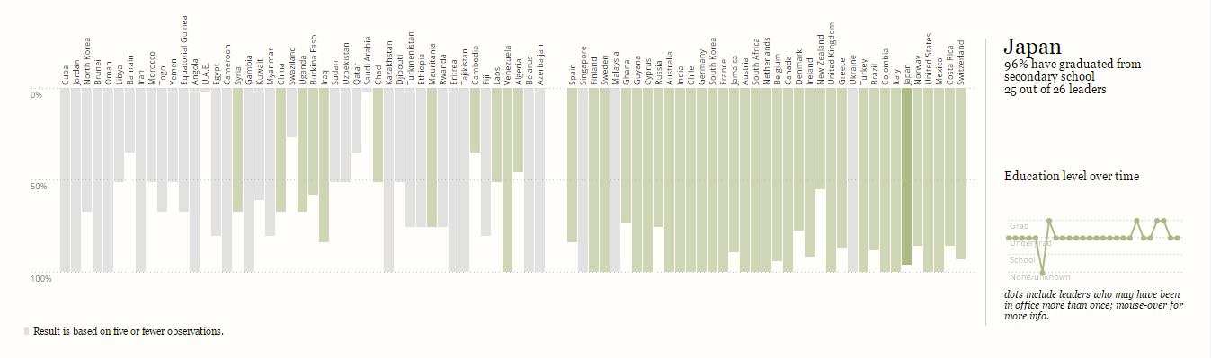
In the third and fourth visualizations, the length of each of the bars gives the percentage of leaders in a particular country who graduated from college (an undergraduate degree or equivalent) and secondary school respectively.
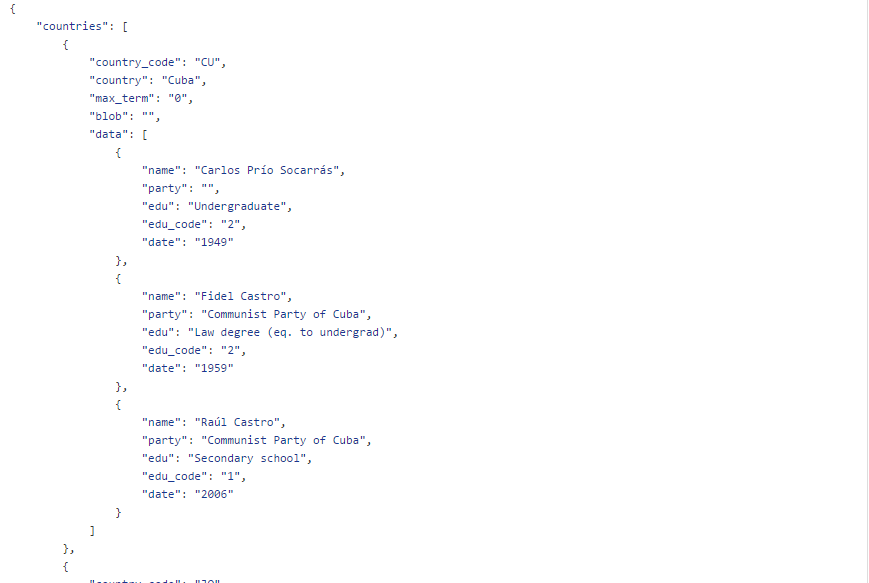
The data for this visualization consists of each country with the names of the leaders, their education and dates of their term in office. The data is in JSON format.
The sources of data are as follows:
A country’s progress depends on its leader. The decisions made by a particular leader are a result of his/her personality and level of education. More educated leaders do not necessarily mean efficient decisions – however, it is one of the defining factors. Hence, people might want to ask questions like:
This application provides the visualizations that show the leaders of a particular country and their tenures (first visualization). In the later visualizations, the percentage of leaders with specific education level is represented. In all the visualizations, a comparison is made possible between the democracies and non-democracies. However, this visualization cannot offer the worldwide view of how the education level of leaders effect the economy and progress of nations. It also does not provide a means for the user to look at the information about the entire world leaders and their education at a glance.
This application answers most of the questions that users generally have regarding the education of world leaders but there is a room for improvement in few aspects: